Get your home interior design budget estimate


-
Trending articles
-
![Beautifulhomes]() 40W Edison Filament Small Cylinder E-27 Bulb (BL2-10023)
40W Edison Filament Small Cylinder E-27 Bulb (BL2-10023) -
![Beautifulhomes]() Look At Me (Smokey Grey) Pendant Light
Look At Me (Smokey Grey) Pendant Light -
![Beautifulhomes]() 20 traditional living room ideas to decorate your living room
20 traditional living room ideas to decorate your living room -
![Beautifulhomes]() Living sustainably means living frugally, says the founder Budget-friendly Living Room
Living sustainably means living frugally, says the founder Budget-friendly Living Room -
![Beautifulhomes]() 20 traditional living room ideas to decorate your living room
20 traditional living room ideas to decorate your living room
-
- Book free site visit


-
![Commodo in venenatis suscipit quam Full of writing, reports, and recommendations.]() 40W Edison Filament Small Cylinder E-27 Bulb (BL2-10023)
40W Edison Filament Small Cylinder E-27 Bulb (BL2-10023) -
![Commodo in venenatis suscipit quam Full of writing, reports, and recommendations.]() Look At Me (Smokey Grey) Pendant Light
Look At Me (Smokey Grey) Pendant Light -
![Commodo in venenatis suscipit quam Full of writing, reports, and recommendations.]() 20 traditional living room ideas to decorate your living room
20 traditional living room ideas to decorate your living room -
![Commodo in venenatis suscipit quam Full of writing, reports, and recommendations.]() Living sustainably means living frugally, says the founder Budget-friendly Living Room
Living sustainably means living frugally, says the founder Budget-friendly Living Room -
![Commodo in venenatis suscipit quam Full of writing, reports, and recommendations.]() 20 traditional living room ideas to decorate your living room
20 traditional living room ideas to decorate your living room
-

Home Design Ideas

-

Living Room Designs
-

Bathroom Designs
-

Study Room Designs
-

False Ceiling Designs
-

Tile Designs
-

Hallway Designs
-

Modular Kitchen Designs
-

Dining Room Designs
-

Balcony Designs
-
Home Office Designs
-

Bed Designs
-

TV Unit Designs
-

Bedroom Designs
-

Pooja Room Designs
-

Wardrobe & Cupboard Designs
-

Crockery Unit Designs
-

Flooring Designs


-


Design Ideas
-


Services
-


Decor
-


Editorial
-


More


Patricia and Mathai's eclectic Delhi Home


Take a tour of this New Delhi home designed by Shivani Dogra that shows you how to work the colours of the season in your décor
For those wondering how to pair this season’s on-trend colours- aqua and teal with soft furnishings, would do well to take cues from Patricia and Samuel Mathai’s New Delhi residence designed by Shivani Dogra. With a basic palette consisting of teal and aqua blue, the interiors reflect an instinctive understanding of how colours can transform an interior space, open it up and give it the illusion of space. The result is a home that reflects what the homeowners wanted from the start of the design process- adapting a more contemporary style to their home, while keeping a safe distance from traditional Indian décor.
The homeowners are a well-travelled couple with two children; Mathai is a successful businessman while Pat is an NID graduate from one of the first batches. Between the two of them, each was particular about what they wanted in their décor. Finding a mid-way solution was key to the final design.
“Patricia wanted a space that was colourful. She was unafraid to use bright colour. Her husband however, wanted things more sober. We chose the middle path with a 45% tilt towards Pat’s choice of colour,” says Shivani.
The furnishings were largely sourced from Good Earth. Shivani had a colour palette in mind when she started, consisting mainly of aqua, teal, magenta, grey, peacock green and hues that went with these main colour choices.
As the project got underway, the architecture of the house and the dining room posed major constraints. The dining room was in the middle of the house with no natural light. It was surrounded by the living room and the bedrooms and a room that was visible to anyone visiting the space. It had to be done right, despite there being little that could be done to structurally alter the space for more light.
“We couldn’t structurally alter this room to let in more light since it was surrounded by other private rooms and a shaft.

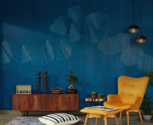
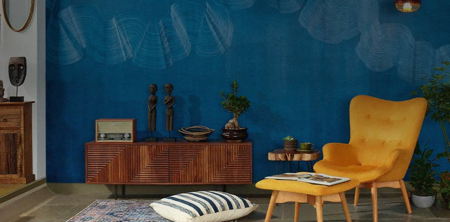
A view of the living room.
We set about by first changing the flooring and the walls to white which automatically opened up the space. To this we added bright pops of colour and carefully chosen artifacts, soft furnishings and flowers which were cheerful and made the room more welcoming,” recalls Shivani.
There were a number of structural elements that were modified to suit the new design. The flooring was changed from brown to white. The windows of the home were changed to a simpler style, to readjust the air conditioners which were a bit of an eyesore in their initial positions. The main drawing room window and door was changed to let in more light and to simplify a previously complex arrangement. Mirrors were added to areas that seemed cramped on space, to give an illusion of space. An older, unnecessarily carved POP cornice was removed; an open kitchen was changed into an enclosed one and the bathrooms were re-done. The doors were repolished, hardware changed, stripped of previous mouldings and some of them even painted.
The family wanted a desk and seating arrangement in every bedroom and a living room that could accommodate up to 10 guests. The bedrooms were designed keeping in mind the preferences of their occupants. Their daughter Stephanie wanted a simple bedroom in a blue palette, with no pictures. Gingham curtains and an old desk were additions to this scheme.

A view of the dining room where colour is brought in, in the form of flowers and upholstery.

The cabinet in the living room.
Pat and Mathai had very different views on the colour for the master bedroom-- while the former wanted yellow and a lot of bright hues, Mathai wanted a neutral toned space. The final decision was made to stick to a minimal use of yellow. “The colours of this room ranged from teal to mustard and aqua-- colours that were similar in tone to the rest of the house, yet completely the room’s own. We turned an old double bed into a four poster and also created areas for seating and a desk,” says Shivani. The cupboard was given a coat of teal to change it from it’s original brown. The chairs were reupholstered to suit the new palette.
A gallery wall was employed in the master bedroom with prints that evoked nature, music or the outdoors—“Something happy to wake up to every morning,” exclaims Shivani.
The bedroom and the living room are Patricia’s favourite spaces, while her husband loves the dining area which is where he does his reading and writing.
For Shivani, this has been a project that’s been challenging and satisfying at the same time. “Interior design is not instantly gratifying; it takes months before you see your vision come to life and a day to enjoy it,” she smiles. With a happy client by her side though, this labour of love has been well worth the effort.


Colour was introduced through the upholstery in the living room, much of which was sourced from Good Earth.

The gallery wall sits above the study area in the master bedroom.
A view of the dining room where colour is brought in, in the form of flowers and upholstery.

A view of the master bedroom.

A view of the wardrobe and bed in the children’s bedroom.

The interiors of one of the children’s bedroom.

Get Started with your interior design journey with us!
Speak to our design professionals

Tell us more and you may qualify for a
Get tailored made designs from our interior design services by asian paints.
What’s the status of your home possession?
What’s the condition of your home/space?
Will you be living in your space during the renovation?
 Previous Question
Is your interior design budget over 4 lakhs?
Previous Question
Book next available appointment slots with our experts!
Please Select Date and Day
Previous Question

Something went wrong!
We were unable to receive your details. Please try submitting them again.


Appointment Scheduled!
Thank you for giving an opportunity to Asian Paints Beautiful Homes Service! Our Customer Experience Specialist will get in touch with you soon.
Appointment Date & time
Thank You!
Our team will contact you for further details.

Thank You!
Tell us more and you may qualify for a
What’s the status of your home possession?
What’s the condition of your home/space?
Will you be living in your space during the renovation ?
 Previous Question
Is your interior design budget over 4 lakhs?
Previous Question
Book next available appointment slots with our experts!
DEC 2023

Please Select Date and Day
Previous Question

Something went wrong!
We were unable to receive your details. Please try submitting them again.


Appointment Scheduled!
Thank you for giving an opportunity to Asian Paints Beautiful Homes Service! Our Customer Experience Specialist will get in touch with you soon.
Appointment Date & time
17 Oct 23, 03.00PM - 04.00PM