Get your home interior design budget estimate


-
Trending articles
-
![Beautifulhomes]() 40W Edison Filament Small Cylinder E-27 Bulb (BL2-10023)
40W Edison Filament Small Cylinder E-27 Bulb (BL2-10023) -
![Beautifulhomes]() Look At Me (Smokey Grey) Pendant Light
Look At Me (Smokey Grey) Pendant Light -
![Beautifulhomes]() 20 traditional living room ideas to decorate your living room
20 traditional living room ideas to decorate your living room -
![Beautifulhomes]() Living sustainably means living frugally, says the founder Budget-friendly Living Room
Living sustainably means living frugally, says the founder Budget-friendly Living Room -
![Beautifulhomes]() 20 traditional living room ideas to decorate your living room
20 traditional living room ideas to decorate your living room
-
- Book free site visit


-
![Commodo in venenatis suscipit quam Full of writing, reports, and recommendations.]() 40W Edison Filament Small Cylinder E-27 Bulb (BL2-10023)
40W Edison Filament Small Cylinder E-27 Bulb (BL2-10023) -
![Commodo in venenatis suscipit quam Full of writing, reports, and recommendations.]() Look At Me (Smokey Grey) Pendant Light
Look At Me (Smokey Grey) Pendant Light -
![Commodo in venenatis suscipit quam Full of writing, reports, and recommendations.]() 20 traditional living room ideas to decorate your living room
20 traditional living room ideas to decorate your living room -
![Commodo in venenatis suscipit quam Full of writing, reports, and recommendations.]() Living sustainably means living frugally, says the founder Budget-friendly Living Room
Living sustainably means living frugally, says the founder Budget-friendly Living Room -
![Commodo in venenatis suscipit quam Full of writing, reports, and recommendations.]() 20 traditional living room ideas to decorate your living room
20 traditional living room ideas to decorate your living room
-

Home Design Ideas

-

Living Room Designs
-

Bathroom Designs
-

Study Room Designs
-

False Ceiling Designs
-

Tile Designs
-

Foyer Designs
-

Modular Kitchen Designs
-

Dining Room Designs
-

Balcony Designs
-
Home Office Designs
-

Bed Designs
-

TV Unit Designs
-

Bedroom Designs
-

Pooja Room Designs
-

Wardrobe & Cupboard Designs
-

Crockery Unit Designs
-

Flooring Designs


-


Ideas
-


Services
-


Decor
-


Editorial
-


More


Soothing neutrals VS bright colours: experts tell us what works best


We spoke to Shabnam Gupta and Ravi Vazirani, two designers with diverse design aesthetics, and asked them the merits of their respective design sensibilities, and why their way works best
In this introductory column, where we’ve decided to wade into debate-worthy topics around design and home decor, we begin by tackling the conundrum of brights versus lights—with the help of experts, of course. The big question is to find out which way to lean—towards the neutrals such as whites and beiges and creams, or towards the bold patterns and brighter hues.
Interior designers Ravi Vazirani and Shabnam Gupta, sitting at opposite ends of the shade card, tell us why they champion the aesthetic that they do. Light versus bright, bold against subtle, neutral as opposed to vivid—great design lies in the eye, and imagination, of its creator. Where do you think you belong? Read on to find out.

Interior designer Ravi Vazirani is inspired by the organic style evident in the works of Vincent Wolf, and in Roman and Williams’s vision of slow design.
Ravi Vazirani: A Zen Space of Mind
“I like homes to be calm and welcoming. Don’t try too hard and don’t over-design - according to me, that is the first thing to keep in mind when doing up your space. It’s all about on-site understanding of design and detail that gives sense to the creation. A person with a preference for this kind of an aesthetic will be someone with an evolved sense of style versus a flashy taste for loud colours. Therefore, before going into the nitty-gritty of designing homes, it is very important to know the client and understand their lifestyle.
For that subtle elegance, you can also explore the possibility of introducing crafts, materials and textures which is limitless.
Greenery therefore plays a big role in ensuring that your home achieves that vibe; it could be in small nooks and corners or, if you have a bigger space, in the courtyards. Often, when clients insist on colour, we manage to work around it proportionally—say a green or grey wall to add an accent to the space. You can also make choices that complement the need for colour. But it is not workable to do colour, statement furniture, patterns and prints—all in one space!
Ultimately, well-designed spaces should be open to constant additions, changes and they should age gracefully. It is important to investigate possibilities of incorporating a fusion of cultures and aesthetics into Indian homes, without having to resort to bright colours. It’s a rule of thumb I follow in my own personal spaces as well.”
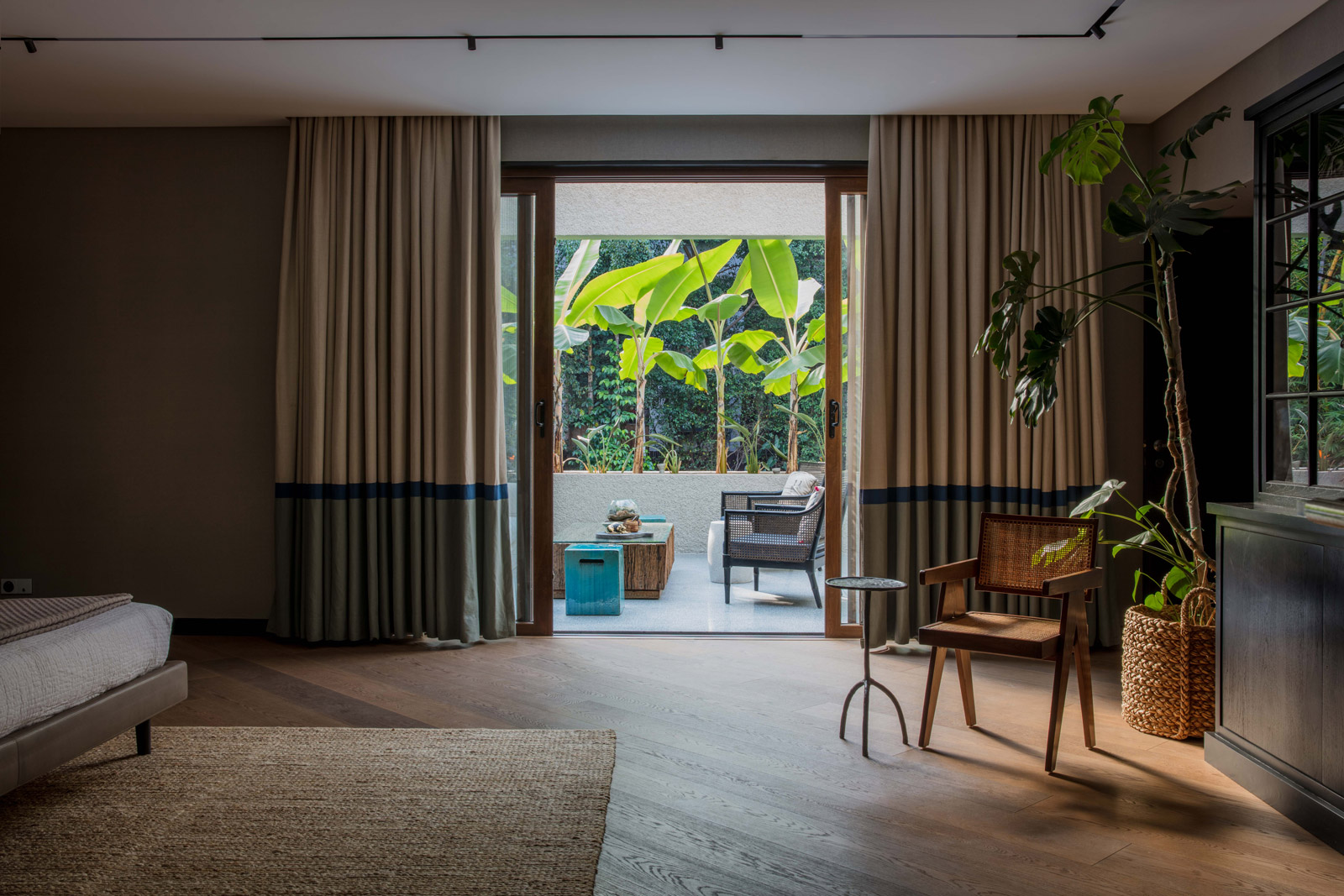
Master bedroom for in a private home in Pune.
About Ravi Vazirani: The Mumbai-based interior designer, founder of Ravi Vazirani Design Studio, believes that the interplay of materials and natural elements can ensure spaces get a distinct look. He is known for his understated palettes, and an emphasis on muted tones and subtle elegance. His passion for slow living shines through in his perspective on understated design and the relationship he develops with clients.
Ravi Vazirani’s tips for light summer décor
Design feel: Understated, minimal, Zen-like calm
My special relationship with colour: “Summer palettes should evoke a winding-down effect on walls through greys, greens and nude pinks or blush. You want to walk into a relaxed vibe. Play with pastels and lighter tones besides just whites or beiges, though they are timeless.”
Summer must-haves: “Introduce greens indoors for an element of freshness in small apartments. Materials and textures could be quick fixes for homes: an interesting rug in a neutral colour to uplift the look of floors, or a slip cover in light linens for the sofa can do wonders.
Colour code: “Have fun with colour but keep in mind that you have to live with the chosen hues. I’d rather live with subtle colours than bright hues, so I can keep changing the look from time to time.”
Shop the look: Jaipur Rugs, Atmosphere, Chunilal Mulchand Furnishings

Living room for an apartment in Imperial Towers, Mumbai. The walls are finished in a concrete texture and the indoor plants are a RVDS signature.

Shabnam Gupta has designed the homes of Kangana Ranaut and Irrfan Khan amongst others high profile Indians.
Shabnam Gupta: Pop Goes the Colour Card
“As an interior designer, my projects include diverse spaces—urban residences, weekend homes in the countryside and hospitality projects. While each space has different requirements, what ties them all together is the play of colour and texture. One walks the tightrope with pop art, but the beauty eventually lies in judiciously using colour in the right doses. And for me, it has always been about exploring layers in design—pretty much like life itself.
My approach to designing spaces has, to a large extent, been inspired by my love for nature; it was something that began in childhood and helped cultivate my aesthetic sensibility. Apart from that, my go-to inspiration has always been Europe, the interiors of residential spaces in Indonesia, Africa and Vietnam, and the many sojourns to art galleries and flea markets across the world. Combined with my bohemian aesthetic, it all finds expression in the way I use vibrant colours, patterns, wood and metal elements. A preference of all things Indian is also evident in my work, as are vintage, industrial and handcrafted designs, which form a strong element of my aesthetic. In fact, you can expect me to ‘mess up’ a branded Italian sofa in my own vintage style!
While colour is significant, light and wind are also extremely important. My home is very breezy and has been done entirely in taupe. The only exception is my media room, which is highly stimulating space with strong colours like teal blue and emerald green. The pop hues are seen in the cushions, artworks, Afghani kilim rugs and sunny yellow curtains.
Natural light, landscape and colour are all essential for a well-designed home. In the right proportion and used in the correct combination, a well-lit, vibrantly coloured home that is embellished with nature can transform not just your space, but your whole world.”

This living room inspired by garden-spaces has an exposed ceiling with a floral light installation. The balconies, encompassing the living room from three sides, are filled with tall green plants that act as a screen.
About Shabnam Gupta: The founder of interior design studio The Orange Lane, and product and lifestyle brand, Peacock Life, Shabnam Gupta’s signature strokes are best described by pop accents of expressive colours, quirky art and unconventional ethnicity. Bright colours and patterns characterise her work, which is overlaid with a touch of the vintage and an evident preference for Indian motifs.
Shabnam Gupta’s tips for bright summer décor
Design feel: Eclectic, boho, happy and soulful
My special relationship with colour: “We live in a country of colourful festivals. And for me, colour is very integral. Even if it’s a simplistic house, we render small pops of colour—say on cabinets or walls—even if the client doesn’t want to push the boundaries.”
Summer must-haves: “Opt for fresh hues like limes, yellows, soft blues, whites and taupes. Play with mulls, à la Greece’s Santorini island—think calming shades reminiscent of a seaside resort, such as turquoise teamed with limes and beiges. You can also try fiery accents with neutrals, such as coral with grey.”
Colour code: “Trends are very limiting. I prefer something timeless. Colour also depends on how experimental you are: if you live alone, I would recommend that every wall have a different colour. In addition, the quality of light also matters.”
Shop the look: Peacock Life for vintage and pop art; Chumbak for kitsch; Nicobar for breezy classics; Nappa Dori for colourful trunks and leather stationary.

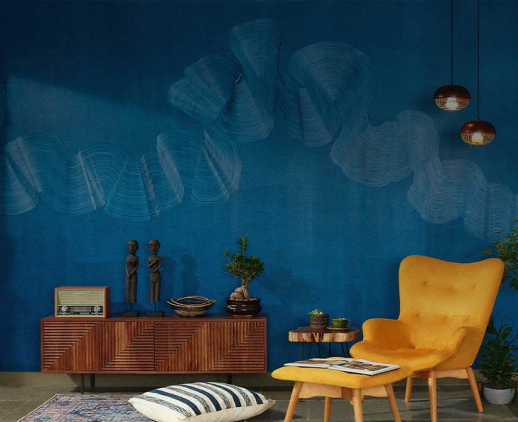
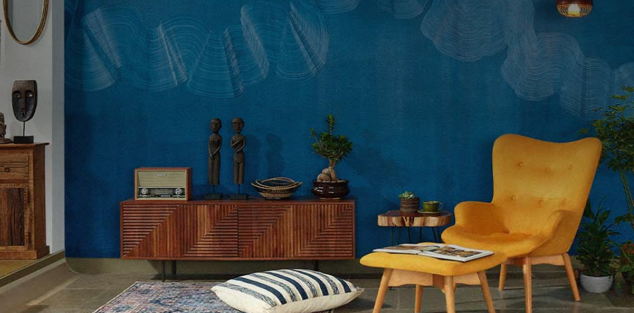
This ink-blue passage is decorated with cut-out floral motifs, decorative frames and art sculptures.

Get Started with your interior design journey with us!
Speak to our design professionals

Tell us more and you may qualify for a
Get tailored made designs from our interior design services by asian paints.
What’s the status of your home possession?
What’s the condition of your home/space?
Will you be living in your space during the renovation?
 Previous Question
Is your interior design budget over 4 lakhs?
Previous Question
Book next available appointment slots with our experts!
Please Select Date and Day
Previous Question

Something went wrong!
We were unable to receive your details. Please try submitting them again.


Appointment Scheduled!
Thank you for giving an opportunity to Asian Paints Beautiful Homes Service! Our Customer Experience Specialist will get in touch with you soon.
Appointment Date & time
Thank You!
Our team will contact you for further details.

Thank You!
Tell us more and you may qualify for a
What’s the status of your home possession?
What’s the condition of your home/space?
Will you be living in your space during the renovation ?
 Previous Question
Is your interior design budget over 4 lakhs?
Previous Question
Book next available appointment slots with our experts!
DEC 2023

Please Select Date and Day
Previous Question

Something went wrong!
We were unable to receive your details. Please try submitting them again.


Appointment Scheduled!
Thank you for giving an opportunity to Asian Paints Beautiful Homes Service! Our Customer Experience Specialist will get in touch with you soon.
Appointment Date & time
17 Oct 23, 03.00PM - 04.00PM